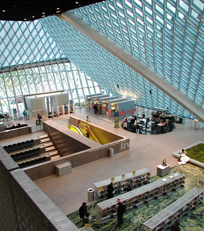
I had a fun trip to the amazing Seattle Public Library (designed by Rem Koolhaus) to do some research on a project I'm working on.
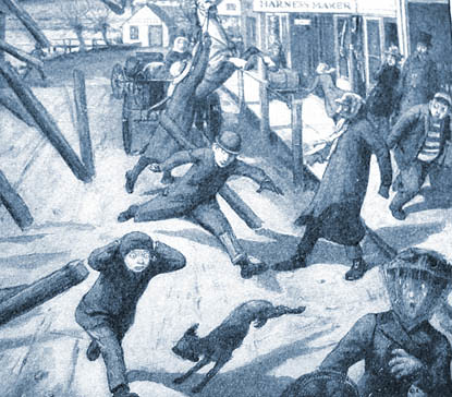
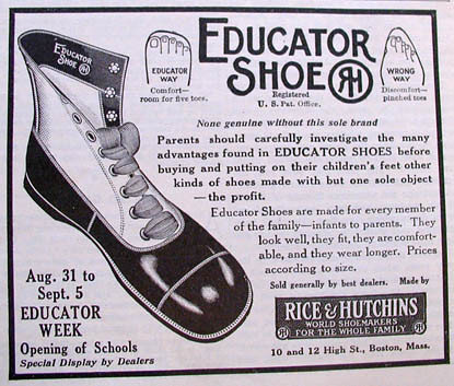
Just visiting this ultra modern library seems like an amazing trip to the future. But then looking 100 years into the past at some old magazines from 1907 was equally entertaining. It's fun doing the basic research on a historical subject... getting all the detailed first hand pieces of the puzzle.

Astonishing to see all the things that have changed and all the things that haven't changed. But then I could spend years just browsing through old forgotten journals. It's the same experience that I hear archaeologists talk about, how they're so excited to think no one has seen the artifacts they're digging up for thousands of years. Well I'm sure there's very few people looking into Educator Shoes either!

I think one of the main joys in being an historian is dwelling in that timeless space of the imagination... to read an article and think that no one else has read this article in 100 years. No doubt it's the same motivation that helps to drive the archaeologist.
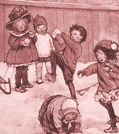
I was particularly amazed to see how contemporary the children's illustration from 1907 looks. It seems almost as if it could as easily have been done in 2006 as 1906.


5 comments:
I cannot imagine using a library like this John. Ours are so small and old (quaint!) by comparison.
All that space and light, and no bookshelves crammed in.... wow!
Even the newer purpose-built local library here is just like an office space with shelves around the walls and has made poor use of space in the designing.
This was the first time I'd been to this library to actually try to use it to find something... and I have to say it's a very confusing layout. All the floors are slanting and there's no clear floor numbers... they're all kind of half floors. I kept getting lost every time I turned around.
Also all the books are jammed into a kind of claustrophobic space... to make room for all the soaring empty space over the lobby... so I actually think it would be more useable if the book areas were given more space and the lobby less.
But it's sure different... no disputing that quality about the place.
Your library is gorgeous, but I'm not surprised to hear that it isn't a great place in which to read or conduct research.
I've found that some of the most acclaimed of the current architecture superstars (Rem Koolhaus, Frank Gehry, etc.) ignore the fact that public buildings should serve the needs of the people; it is the sad triumph of razzle-dazzle form over function.
The old publications are entertaining, but it may be a tiny bit unsettling to realize that 100 years ago, there wasn't a single major newspaper that didn't employ a staff of illustrators. If you haven't yet read it, get that library to fork over a copy of "New York World: Graphic Art on Sunday" by Nicholson Baker and Margaret Brentano. Amazing stuff, much of it with a suprisingly contemporary look.
Thanks for the tip on that book... I've put it on order from the library. Looks just great!
jn
That library looks amazing!
Post a Comment